Don’t use Matplotlib or Seaborn for Your Python Plots
It’s time to up your visualization game

Data Visualization is the most comfortable and intuitive way for human brain to effectively understand any information. For anyone working with data, the ability to create beautiful intuitive vizualisations is a very important skill to have to be able to effectively convey the findings and drive actions.
R, provides some great data visualization (ggplot2, leaflet) and dashboarding (using R Shiny) packages using which you can create beautiful visualizations. Python, on the other hand, lags behinds a bit in this aspect as matplotlib is not a great visualization package.
Seaborn is a good alternative for creating static plots in python but doesn’t have the capability of making these interactive. With static plot, we cannot zoom into the interesting sections of the plots, hover over the plots to see the specific information and more.
So, here comes the plotly package !

Plotly is a Python library for creating interactive, publication-quality visualizations. Plotly not only makes the plots interactive, a functionality missing in matplotlib or seaborn, but also provides a variety of more charts such as :
- Statistical Charts such as tree plots, error bands, parallel categories diagram etc.
- Scientific Charts such as contour plots, log plots etc.
- Financial Charts such as funnel charts, candlestick charts etc
- Maps such as bubble map, density map etc.
- Bioinformatics and more.
That was all about the theoretical explanation of why you should use plotly over matplotlib or seaborn.
Now, let’s see practically !
In the following section, we will use gapminder data to visualize how the India and China progressed socially and economically over the years. We will be doing data selection and manipulation on pandas dataframe, if you are new to pandas then you can learn python for data analysis.
You can open the jupyter notebook and use the codes directly without any modification. Let’s start by installing the plotly package and importing the required packages.
Using graph_objects module, we will be creating the different types of graphs and express module will be used to read the gapminder data.
Now, let’s read the gapminder data using the plotly express and look at the top 5 rows.
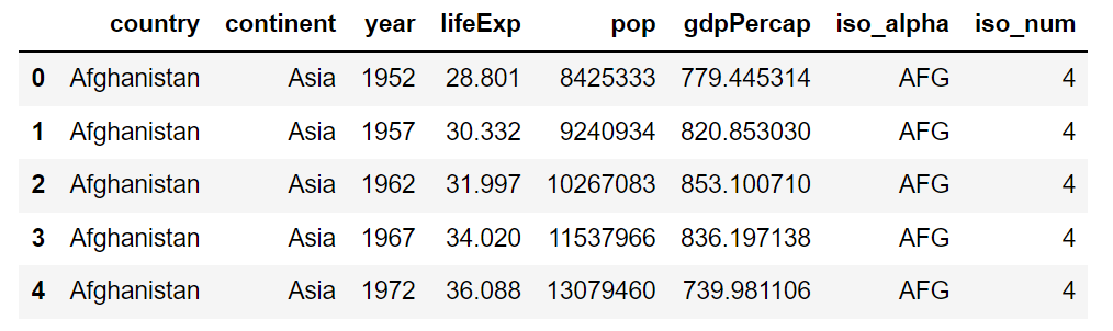
From the above table, we can see that the data contains information around life expectancy, population, gdp per capita of different countries across different years.
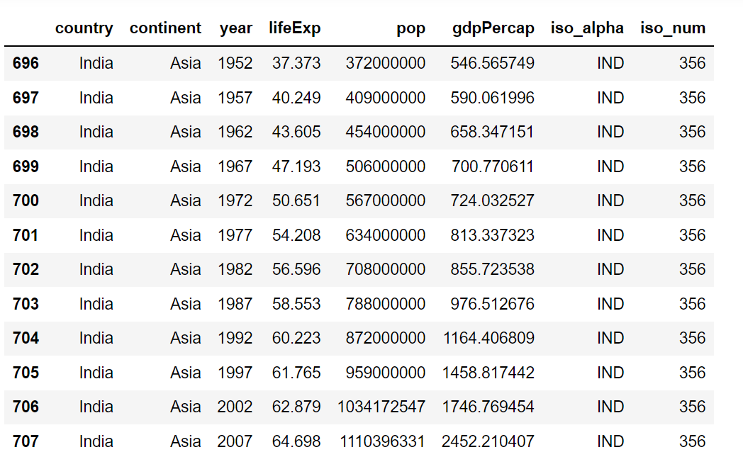
Now, we will filter the dataframe for the India and China.
The below table shows the data for the India. The data ranges from year 1952 to 2007.
Population of India and China
Now, we will create bar graph showing the population of India and China over the years.
Creating plots using plotly graph object module is a 2 step process :
- Setting up the figure function within which we will set the data argument. The data argument is set to a list having the bar functions(go.Bar) for India and China. Within the bar function, we set the x axis to year column, y axis to population column, the marker color to indianred/blue and name of the bars to the country name.
- Setting the text for title, xaxis and yaxis of the charts using update_layout function.
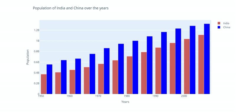
- From the above chart, we can see the population of both the countries have grown at similar rate.
Life Expectancy over the years
Whenever we have a time series data(measurements over years / months / weeks etc) line chart is the best option to show the trend.
Using the following code, we are showing how the life expectancy changed over the years for India and China.
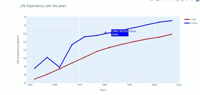
- There has been a consistant gap between the life expectancy of the 2 countries, expect around 1960 when the life expectancy in China dropped suddenly due to ‘The Great Chinese Famine’.
Life Expactancy vs gdp per capita over the years
When we want to see the interaction between 2 continuous(numeric) features, scatter plot is the go-to plot.
In the following code, we are creating the scatter plot between Life expactancy and gdp per capita of the 2 countries.
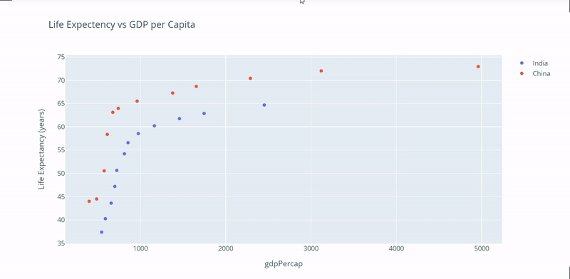
- For both the countries, life expectancy has increased with the increase in gdp per capita.
- Compared to India, China has made significant improvement in the gdp per capita.
World Development over time : An Animation
Using bubble plot, we can show 3 dimentions (x axis, yaxis and size of bubble) over a 2D plot.
Using the following code, we can create bubble chart using scatter function of plotly express module.
Let’s understand some important arguments of the function :
- size : This is set to a numeric column that will capture the size of the bubble.
- color : This is set a categorical column that will capture the color of the bubble. In our example, one color is assigned to each continent by default.
- log_x : Set the X-axis(gdp per capita) to log-scaled.
- size_max : Set the maximum size of the bubble, when size argument is set. This acts as a size standardisation parameter.
- animation_frame : Values of the dataframe column that are used to assign marks to the animation frames. In our example, the argument is set to year column.
- animation_group : Rows with matching ‘animation_group’ will be treated as if they describe the same object in each frame. We want to see how each country progressed over the years, so setting it to country column.
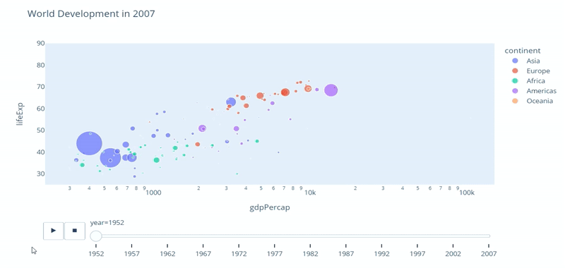
- Countries across the world have developed quite a lot over these years.
- We can see the direct correlation between life expectancy and gdp per capita (both increase with time) for all the countries.
A lot more findings can be derived from this chart, share what you find over the comments.
What’s more !
You can also create interactive dashboards using plotly. Dash is the plotly framework for creating beautiful python dashboards quickly without having to learn HTML, CSS and Javascript. Learn more about Dash here : https://bit.ly/3jQVWli
You can follow me, if you love to read about Data Science tools, technologies and use cases.
https://medium.com/codex/dont-use-matplotlib-or-seaborn-for-your-python-plots-d5f03e750757